RSS |

Trend Technician

Just another WordPress weblog

Advertisement

Posts Tagged ‘ chart analysis ’

NASDAQ

Everyone liked the candlestick video so much I thought I’d point out another cool video that makes a good point about how to look at things simply. Those who’ve been reading my technical analysis basics series can tell that I’m a fan of simple chart analysis. This video gives a great example of looking at trends with an eye for a solid trendline, and using other tools for confirming data.

Given several other indicators of broader economic welfare, most potently the money supply, I’ve got a bit of a bearish feel already. The NASDAQ in particular has been a bit overzealous in it’s climb and seems a possibility for an appealing short. Looking at the trendlines in this video you can see some compelling indications that it may be time to start closing out longs at a bare minimum. Of course the evidence has mounted since this video was made and it was a good opportunity to make some money, or at least save some.

It’s also pretty striking to look at the kind of climb we’ve had without any significant retracement. Even if it’s only a short-term dip, there could very well be some money making opportunities here. I never rush in when fighting the trend long-term, but if you’ve been long you’ve made quite a bit of money and you should at least take a look and see if there’s evidence that the tide might be turning.

Click Here to Watch The Video

NASDAQVideo

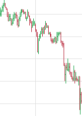
You probably aren’t as familiar with candlestick charts as you should be.  For years I used solely bar charts and trained my mind to read that particular type of chart and I can tell you this:  If you’re not using candlesticks you’re probably leaving money on the table.

Am I saying that candlesticks are better than bar charts?  We’ll get to that as well as a great resource to help you make money using candlesticks, but first let me tell you why you should familiarize yourself with candlestick charts.

As you read more and more charts your brain starts to make subconscious snap interpretations.  You learn a particular type of chart the way you might learn a language.  Before you buy or sell you’ll sit down and do rigorous analysis, but having familiarity helps you parse information quickly.  Learning to read candlesticks gives you another dimension from which to analyze a chart and there’s no reason not to know how to use them.

The Difference of Candlestick Charts

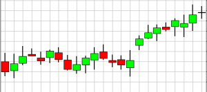
So given that they represent the same data, why do you need candlesticks?  Well if you look at a typical bar chart, a lot of the data is deduced.  You have the same information on a bar chart that you do on a candlestick chart, but some information is not immediately obvious.  Did the stock close higher or lower than it opened?  I can tell this at a glance with a candlestick chart, while I need to read the little nubs on a bar chart to know this.

As I mentioned, the same information is there, but on a candlestick chart some of it has already been processed for me.  Thus my powers of induction are freed to look a little deeper.  From years of experience, my mind can intuit from a bar chart whether a stock went up or down, but that information was obvious to anyone at first glance on a candlestick chart.

The distinct shading of the open and close regions also yields other benefits for helping your mind read a chart quickly.  The candlestick has a tendency to make your mind more aware of the area between the open and close by representing it so visually.  It highlights that difference, where a bar chart does not.  Thus the candlestick chart helps my mind prioritize things that a bar chart doesn’t.

So, are Candlesticks Better?

Candlestick and Bar charts focus on different things and provide different benefits.  Neither is “better,” but this answer to me is clear:  Being able to read both is better than being comfortable with only one.  Why limit your analysis to only one area of emphasis.  Why not be able to get the benefits of both methods?

Learning More about Candlesticks

So now you want to learn more about candlestick charts?  INO’s Trend TV currently has a free video about candlestick charts for its users.  It’s free to sign up, and you’ll have access to the video before you need to decide if you’re interested in the product they offer. They’re also offering three other free videos at this time.

TrendTV's Free Video on Candlestick Charts

TrendTV's Free Video on Candlestick Charts

In this complimentary video, “Advanced Applications of Candlestick Charting,” authors, software programmers, and co-founders of the International Pacific Trading Company, Gary Wagner & Brad Matheny will walk you through:

  • History of candlestick charting
  • How to interpret candlesticks
  • How to merge techniques of Eastern & Western technical analysis together
  • How to merge candlestick techniques with your current trading plan
  • And more…

This 100 minute complimentary video can be found on Trend TV. You don’t have to worry about watching the whole video at once. After you have a password, you can revisit anytime to watch the rest of a video, review a video, or watch other videos on Trend TV.

Go sign up and put another tool in your toolbox.  How can you regret getting more money making weapons for free?  Speaking of which if you haven’t already, be sure to read our technical analysis basics series for more free information.

This article is part of the Trend Technician Technical Analysis Basics series. Be sure to read the rest of the series.

The final component of a classical charting education is the study patterns.  Chartists can name a bewildering array of patterns and it would be ridiculous to try to cover them all.  Moreover it’s not clear that they provide as much value as their proponents might argue.  That being said, there are several basic patterns that are routinely discussed and are worth noting.  If nothing else the fact that people believe in these patterns means they will likely have some merit.

Gaps

Gaps occur when the low of a day is higher than the high of the previous day, or the high of a given day is lower than the low of the previous day.  They are quite easy to see on charts and they tend to stand out.  Gaps often occur on the heels of news or other outside influences, however they can be mysterious.

Typically gaps indicate a burst of momentum in a given direction.  However they can also indicate an aberration that will be corrected.  The conventional wisdom in telling the difference is that gaps that are followed by new extremes in the same direction are indicators in that direction, while those that do not make new extremes will usually “close the gap.”  So if a stock gaps up and subsequently makes new relative highs, then the gap is considered to be “confirmed.”  If on the other hand the stock fails to make new relative highs, it’s likely that the stock price will return to pre-gap levels.

Other Patterns

There are a myriad of other patterns.  We may cover them in more detail in individual articles, but they are of less use than basic support, resistance and trend analysis in the author’s opinion.  Some of the more common ones like the head and shoulders or double top/bottom can be useful tools, but others can be nearly a Rorschach test, where the investor can see what he or she wants to see.  Here is a brief list of some of the more common patterns:

  • Head and Shoulders
  • Lines
  • Flags
  • Triangles
  • Rectangles

Each of these may have some merit, but I recommend using more clear cut indicators in addition to these in your analysis.

This article is part of the Trend Technician Technical Analysis Basics series. Be sure to read the rest of the series.

Once we understand the concepts of support and resistance we can talk about the two basic states a trend can be in: A trading range and a trend.

A Downtrend -- Note the lower highs as well as the lower lows.

A Downtrend -- Note the lower highs as well as the lower lows.

A trend exists when prices are moving in a direction.  When prices are consistently becoming higher, you are in an uptrend and when prices are consistantly lower you are in a downtrend.  This distinction may sound arbitrary but the basic definition is that when prices are reaching higher highs and higher lows then the price is moving upwards and vice versa for downwards.  When prices are not trending they are considered to be in a trading range. In this state, most prices hit roughly the same highs and the same lows.

Obviously these defintions only make sense in terms of a timespan.  A particular issue can be in a long-term uptrend, but a short term downtrend.  This is usually defined by what time period a bar represents on a graph and what kind of timespan in which you are planning on executing your trade.  Moreover traders oftentimes tend to avoid issues when they are in a trading range, however this can be a great opportunity to profit using options.

Trading Trends and Trading Ranges

The rules of trading trends are fairly obvious.  You very rarely want to trade against the trend for the timespan in which you are investing.  While you might trade against a long-term trend if you plan on holding for only a short period of time, or against a short-term trend if you’re planning on holding for a long period of time, typically you want to trade with the trend.  Additionally, profit taking can be very difficult in trading ranges.

This article is part of the Trend Technician Technical Analysis Basics series. Be sure to read the rest of the series.

Probably the first type of chart analysis to come into play is the analysis of area areas of support and resistanceSupport is a price level at which buying increases to either pause or reverse a downtrend.  Similarly resistance is a price level at which selling increase to either pause or reverse an uptrend.  This sounds complex, but is really quite intuitive in practice.

For the purposes of this conversation we’ll assume we’re talking about a stock, although this applies to any traded issue.  Intuitively you can imagine that various members of the market see the stock as atractive at a certain level.  As the price gets lower and lower more members start to see the stock as underpriced.  This effects becomes manifest at a certain price at which there doesn’t remain enough selling power to push it down and the price  “bounces off” the support level.  In this chart that price is roughly 87. [More]